Mobile App Redesign
PhotoSpace
Collaborated with international Korean Universities to redesign the app interface to be more inclusive to global audiences.
Industry
Social Media
Technology
Figma


Background
Photospace struggled to stand out among established photo-sharing apps. To address this, we aimed to build a memorable brand identity and a richer user interface with enhanced sharing and customization tools. Collaborating with two international universities in Korea, I gained deeper insights into how cultural factors shape design.
Project Scope
Researched photo-sharing and storage practices in the US and Korea to design a interface that aligns with multiple user audiences.


1
2
3
4
5
6
App analysis
Since many US users weren’t familiar with it, this helped us see how easily they could navigate the interface. Accorss the 3 teams we conducted around 62 interviews. After collecting the data, we shared our observations and identified the main pain points.
User Journey Mapping
Developed user personas from interviews to design solutions that address identified pain points. Meanwhile Korean Teams, dedicated more time to research more diverse audiences.
Wireframing & Visual Design
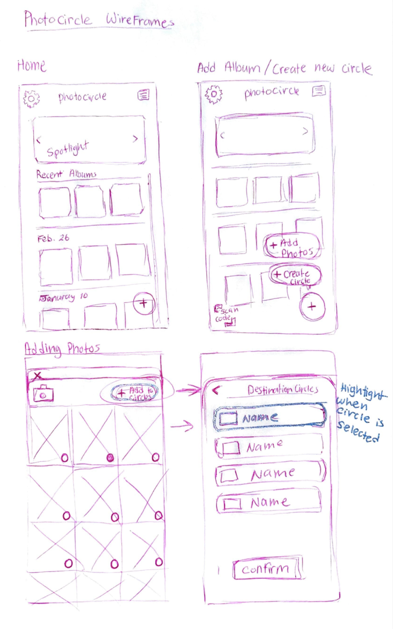
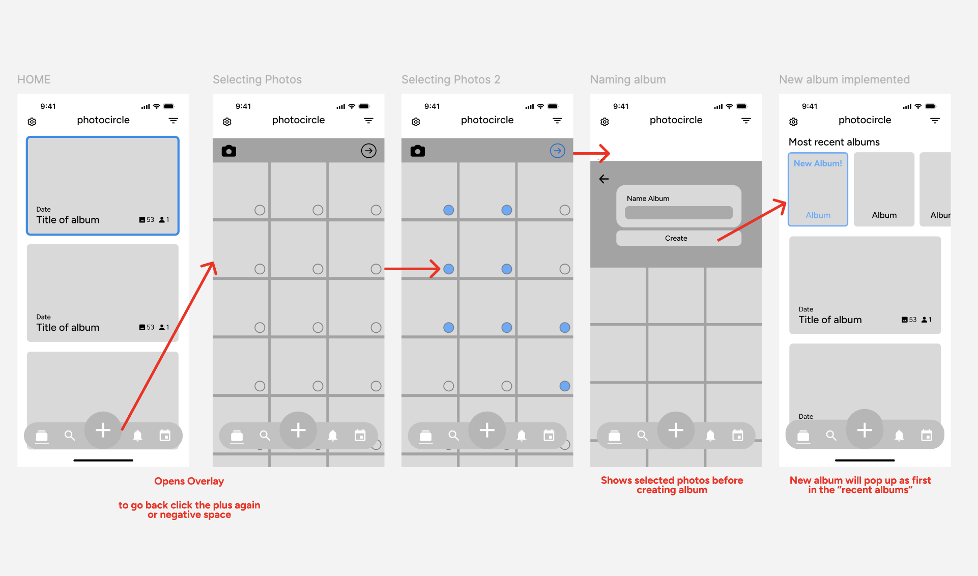
Used Figma to create lo-fi screens for onboarding, album creation, calendar view, and sharing flows. Also discussed adjusting the brand’s color scheme to add variety and boost visual appeal.
User Research & Testing
Prototyped and A/B tested lo-fi wireframes for features like album creation and calendar view. Insights showed users prefered photo filters and find a search tool convenient.
Hi-fi Wireframing & Prototyping
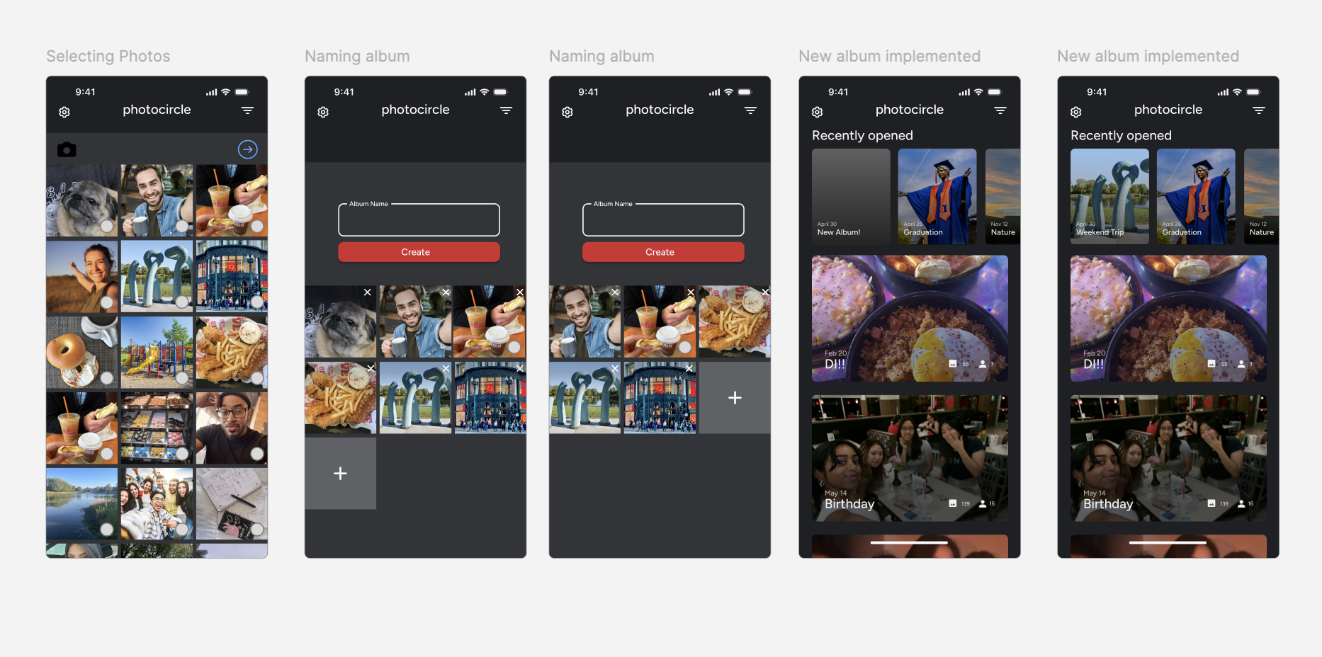
Designed with a new color scheme (adding 3 colors) using the 60-30-10 rule and created a fully responsive prototype featuring rebuilt user flows.
Research Insights
Tested hi-fi prototypes with about 45 users and gathered insights for future design improvements. Users navigated the redesign with clearer intent and valued the photo filter options.
